
Why The Federal Reserve Gets Inflation Wrong – And Why Monetary Policy Is Always Late
December 29, 2022
By Dr. George Calhoun
Hanlon Investment Management Advisory Board Member
Executive Director of the Hanlon Financial Systems Center
- “When will inflation come down?” – Federal Reserve Chairman Jerome Powell (Nov 30, 2022)
Alas, the answer is unclear, in part because the Federal Reserve does its inflation arithmetic in the wrong way. The mistake is simple, avoidable, and highly consequential.
The Fed uses a formula for calculating the official annual inflation rate that distorts the view of the realtime price trends in the economy, and throws off the timing of monetary policy decisions. As a result, Fed policy is chronically late. It lags the developments in the economy by as much as a year. Moves that are intended to be counter-cyclical – as all monetary policy should be – fall out of sync, and become instead pro-cyclical.
This is why the Fed was late to recognize inflation as it developed in 2020 and 2021. Today, it is why, instead of mitigating the economic damage from the pandemic shock (compounded by the Ukraine war), the Fed’s recent out-of-step moves will end up exacerbating it, likely leading the country towards a recession.
Two Methods of Calculating Annual “Inflation”
The raw data is not the problem. The prices recorded by the Bureau of Labor Statistics and the Bureau of Economic Analysis are accurate. The problem has to do with the way the data is used to calculate the rate at which prices are changing.
There are two alternatives for computing an annual rate of inflation:
- Year-Over-Year (YoY) , where the current measurement is compared to the same period one year ago; this is an annual rate by definition
- Month-Over-Month (MoM) which measures the change relative to the previous month, multiplied by 12 to produce an annualized rate (the Federal Reserve calls this a “continuously compounded annual rate of change”)
The Year-Over-Year method is backward-looking. It shows how prices have changed since last year.
The Month-Over-Month figure is a measure of the current rate of change, and the annualized MoM can be seen as a reasonable projection of the future inflation rate (assuming the current rate is maintained).
The two methods can produce very different numbers, especially when inflation is rising or falling. The latest inflation figures for November provide a good example.
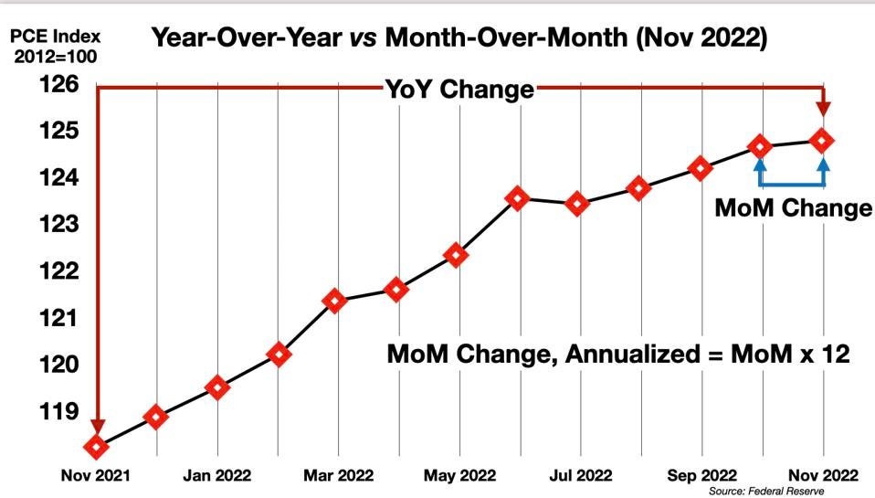
The November 2022 PCE Number
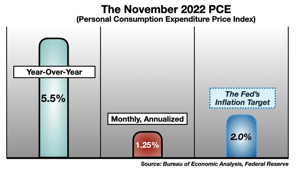
The November Personal Consumption Expenditure Index (PCE), published Friday by the Bureau of Economic Analysis, headlined a 5.5%, year-over-year increase – comparing the November 2022 price level to the November 2021 level. By this measure, “inflation” is still raging, way above the 2% target set by the Federal Reserve.
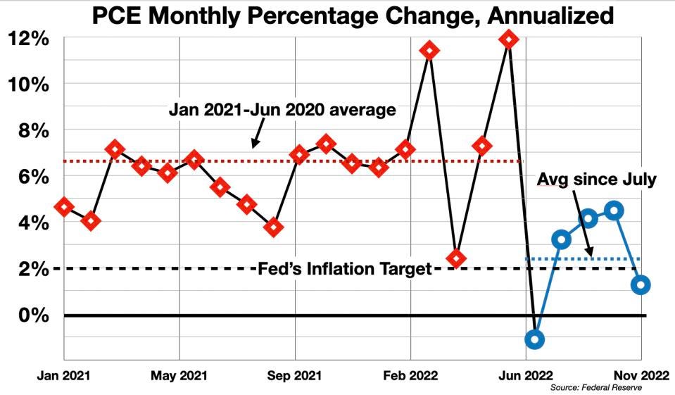
On the other hand, the one-month increase of November 2022 prices over October 2022 was only 0.1% – which equates to an annualized inflation rate of 1.2%. Viewed this way, inflation has been tamed, and is now back below the Fed’s annual target rate.
Two very different pictures, which imply very different policy responses.
If the YoY figure is the true measure of inflation, then the Federal Reserve should keep the pedal down on monetary tightening in all its forms. It should keep raising interest rates, keep up the tough talk, to throw cold water on this supposedly “overheated” economy (meanwhile preparing the public to accept a painful recession as the unavoidable price to pay for bringing the YoY PCE statistics into conformance with the Fed’s expectations – i.e., for “controlling inflation”).
If the MoM figure is the true measure, the Fed should pop the champagne, declare victory – and ease up on interest rates.
Many questions arise. Which measure is most commonly used? How do these measures compare in general? Which is more accurate? What do these measures actually show? Which is more meaningful, more actionable?
Which Measure Is Preferred By Policy-Makers?
“Standard practice” – which encompasses the Fed’s public policy pronouncements, most economic commentary, and journalistic inertia – favors the YoY figure. The inflation headlines always focus on the YoY number. (This true for the Consumer Price Index – the CPI, the other prominent monthly “inflation” statistic – as well as for the PCE.)
Recent YoY numbers support the view that inflation is still out of control. In his November 2 press conference, Chairman Powell was explicit –
- “Inflation remains well above our longer-run goal of 2 percent. Over the 12 months ending in September, total PCE prices rose 6.2 percent…We need to bring our policy stance down to a level that’s sufficiently restrictive to bring inflation down to our 2 percent objective.”
In a speech to the Brookings Institute on November 30, Powell elaborated –
- “Twelve-month core PCE inflation stands at 5.0 percent in our October estimate, approximately where it stood last December when policy tightening was in its early stages. Over 2022, core inflation rose a few tenths above 5 percent and fell a few tenths below, but it mainly moved sideways. So when will inflation come down?” – Jerome Powell (Nov 30, 2022)
How Do These Measures Compare?
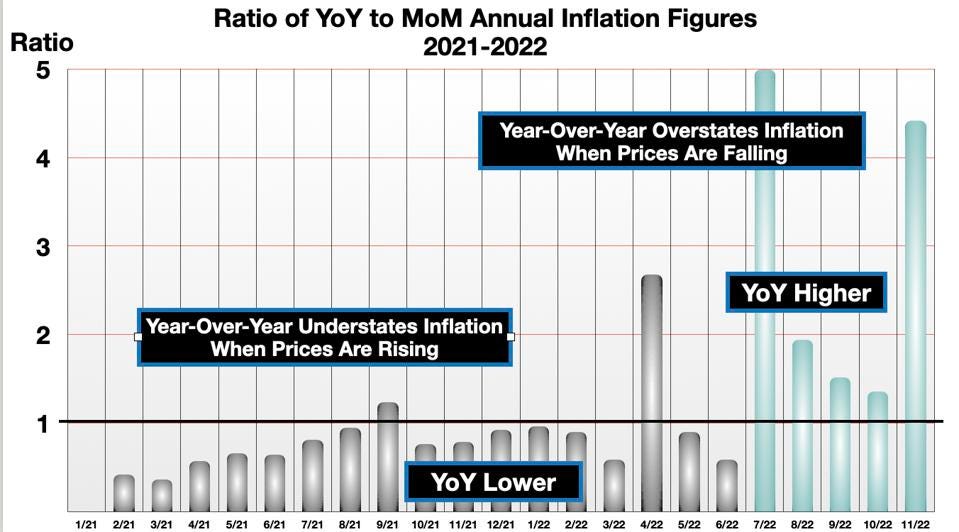
The YoY and Annualized MoM figures rarely align.
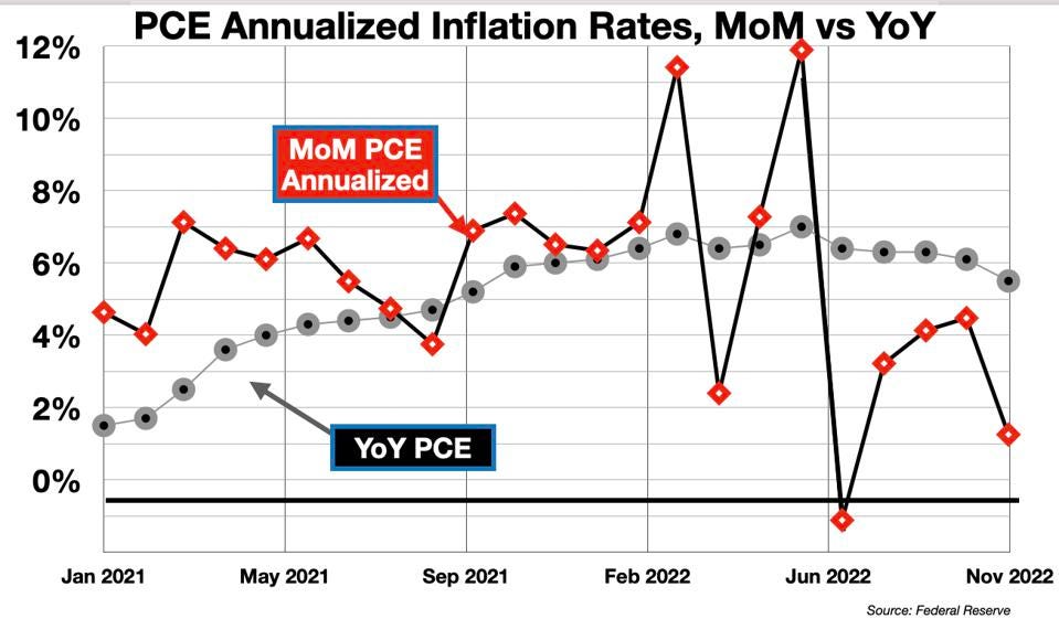
The Year-Over-Year Inflation Rate changes slowly. When inflation is rising, it lags lower than the Month-Over-Month measure. And when inflation is falling, the monthly measure will drop more quickly. When inflation is falling fast, the YoY rate rises above the MoM rate.
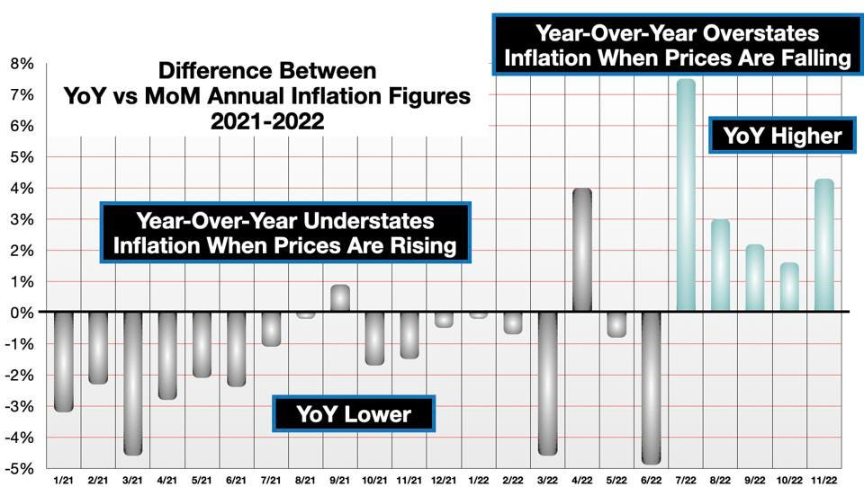
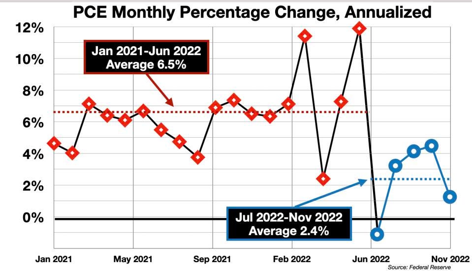
From Jan 2021 to June 2022, as inflation heated up, the YoY rate averaged 16% lower than the MoM rate.
But since July, that has changed. In November, the YoY soared to 4.5 times the annualized MoM. This ratio is approximately the 90th percentile for the PCE series since 1960.
It is a strong indication that inflation is now dropping very rapidly.
Which Measure Is More Accurate?
Superficially, each measure is accurate for its stated objective. YoY gives us a measure of how much prices have risen in the past 12 months, and the annualized MoM tells us how much prices would rise in the next 12 months at the current rate of change.
However, the YoY suffers from several flaws created by the long time-window:
- The YoY smoothes out the ups and downs, the month to month variations over the past year – which is said to be a virtue (i.e., to reduce volatility). But the drag of past data-points also means that measure responds to new events much more slowly. In particular, it does not register accurately the timing of reversals of trends, “turns” in the market or the economy. These are the important events that should trigger decisions or policy shifts, and the YoY obscures them.
- The YoY de-emphasizes the significance of the most recent events – which are usually the most important, to promptly signal changes in the overall situation, and to serve as the most accurate basis for forecasting the coming trend (the most recent month-to-month change is usually more indicative of the near-term future than the year-ago comparison).
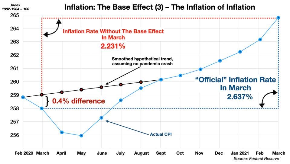
- The YoY also sometimes suffers from the “base effect” – which occurs when the year-ago reference point was unusually low or high, distorting the Year-Over-Year percentage change. The inflation metrics all suffered from this problem following the pandemic shock. In March 2021 (one year following the Pandemic shock), inflation readings (using the CPI) were 40 basis points too high due to this flaw. By May, the base effect had exaggerated the CPI to over 100 bps – a significant error, as described in my previous column (here).
For all these reasons, the Year-Over-Year method is demonstrably less accurate as a measure of the current rate of inflation than the annualized Month-Over-Month figure.
There is also an important problem with the largest component of the index – housing costs. The details of this issue will require a separate column, but the gist is that the measures of housing cost used for both the PCE and the CPI incorporate an additional built-in lag. Because the weight of the housing component is so large – about 1/3rd of the CPI and 1/6th of the PCE – this distortion is significant.
This is well-recognized. Here is Powell’s caveat from his November 30 speech:
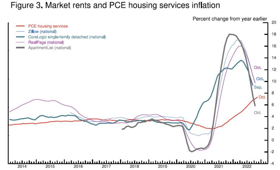
- “Housing services inflation measures the rise in the price of all rents and the rise in the rental-equivalent cost of owner-occupied housing. Unlike goods inflation, housing services inflation has continued to rise and now stands at 7.1 percent over the past 12 months…. Housing inflation tends to lag other prices around inflation turning points, however, because of the slow rate at which the stock of rental leases turns over. The market rate on new leases is a timelier indicator of where overall housing inflation will go over the next year or so. Measures of 12-month inflation in new leases rose to nearly 20 percent during the pandemic but have been falling sharply since about midyear.” – Jerome Powell (Nov 30, 2022)
Powell even includes a chart which exemplifies the inaccuracy of the 12-month averaging method. The YoY housing component of the PCE (the red line) has continued to rise while several more timely measures show a sharp downturn in housing prices in recent months.
The Policy Implications
The Year-Over-Year method of calculating the inflation rate is less accurate, less timely, provides less insight for trend reversals, and is distorted by structural glitches (e.g., the base effect) compared to the annualized Month-Over-Month figure. The traditional PCE (or CPI) is a poor guide for policy-making at the Federal Reserve and elsewhere. In particular, in the last five or six months, the headline YoY inflation measure has missed the important change in the economic weather: The inflationary surge that followed the supply shocks of the pandemic and the Ukraine war is over. Since last summer, widespread disinflationary and even deflationary signals from key sectors of the economy have developed. (See my previous column, here).
On the other hand, the monthly metric captures this shift quite clearly.
Why The Fed Was Late to Recognize Inflation
The lag inherent in the Year-Over-Year method creates a delay in the recognition of new trends, and trend reversals, in either direction, involving either rising or falling inflation.
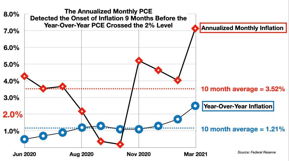
For example, the Federal Reserve has been widely criticized for being “late” in recognizing the onset of serious inflation in the past two years. This was a consequence of the Fed’s reliance on the Year-Over-Year formula, which is always slow to respond to change. The headline (YoY) PCE did not show inflation crossing above the critical 2% level until March 2021. However, the annualized MoM formula clearly detected the uptick in inflation 9 months earlier. It averaged 3.5% over the critical 9 months – a clear signal of inflation gaining strength – while the standard measure averaged just 1.2%.
The immediate policy consequences are obvious.
- The Federal Reserve should not be raising interest rates further at this point. There is a significant risk that monetary policy is becoming pro-cyclical, reinforcing and amplifying the growth slowdown and pushing it too far, into a recession, in pursuit of a policy objective that – the monthly numbers show clearly – has already been realized.
- The Fed’s 2% inflation target also needs to be re-conceptualized. The target is currently defined in terms of the Year-Over-Year formula. By this measure, “2% inflation” is achieved not when inflation actually reaches 2%, but only when inflation has averaged 2% over a full year. This builds in a delay of something like 9-12 months in processing the signal – which puts the Fed “behind the curve.” In contrast, the annualized monthly method shows that the 2% target has nearly been reached.
Summary
The Year-Over-Year method of calculating the inflation rate is essentially blind to the future. It is blind even to the present, as it was in the first quarter of 2021 when inflation was rising, and as it is now that inflation is falling. It tells us where we’ve been, not where we are, or where we are going. It is a fire alarm that begins to ring only long after the fire has started, keeps on ringing long after the fire is actually under control. Reliance on the Year-Over-Year formula is what caused the Fed to miss the onset of inflation in 2020/2021, and it is why the Fed has missed the end of the inflation surge now.
Switching to the Annualized Month-Over-Month method requires no additional effort or investment. It is already available, pre-calculated by the Federal Reserve itself as the “continuously compounded annual rate of change” (available on the FRED site maintained by the St Louis branch of the Federal Reserve). It draws on the same underlying price data. It is far more sensitive to the timing of the trends in the economy, and its adoption as the superior format for inflation reporting would increase the effectiveness and precision of monetary policy, and reduce the chances of an “overshoot” in the current tightening program that could lead to an unnecessary recession.
Chairman Powell asks the question – When will inflation come down?
The answer is that inflation has already come down. The Fed just can’t see it because it is looking through the rear-view mirror. (Which is not good driving practice.)
Follow me on Twitter or LinkedIn.
Click here to download a copy of advisory.
About the Author:
Dr. George Calhoun, a graduate of the University of Pennsylvania, received his Doctorate Degree from the Wharton School of Business. He has served in multiple capacities in the Financial Sector and in the Wireless Communication Industry. He has authored multiple articles on subjects of interest to him and several books. His most recent book “Price & Value: A Guide to Equity Market Valuation Metrics” is available through the Publisher Springer/Aspress. Dr. Calhoun currently serves as the Executive Director of the Hanlon Financial Systems Research Center at the Stevens Institute of Technology and is an Advisory Board Member of Hanlon Investment Management.