Collateral Damage From Fed Policy (3) – Money Market Funds, A ‘Powder Keg’?
March 26, 2024
By Dr. George Calhoun
Vestbridge Advisors, Inc. Advisory Board Member
Executive Director of the Hanlon Financial Systems Center
- “If there is any place where the vulnerabilities of the system to runs and fire sales have been clear-cut, it is money market funds.” – Janet Yellen (March 30, 2023)
- “Rapid growth of the MMF industry, increasing use of MMFs by institutional investors for cash management, larger footprints in the short-term funding markets that contribute to contagion risk and… heightened vulnerabilities.” – A Report by Federal Reserve Economists (2022)

In March 2022, the Federal Reserve began raising interest rates more aggressively than at any time in the last 40 years.
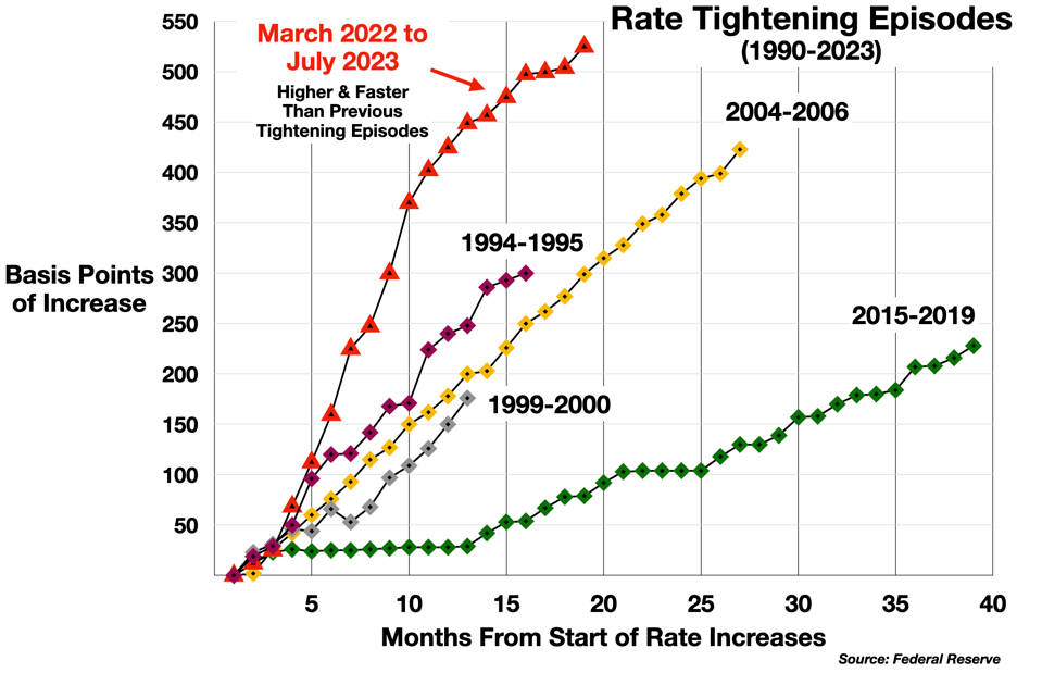
This speed and severity of this policy may not have had much effect on inflation, but it has inflicted significant collateral damage on several sectors of the economy. In my previous column, I examined the impact of the rate storm on the housing market. Here the focus is on another multi-trillion dollar segment of the financial system, where rising rates may be distorting the market and creating new systemic risks: Money Market Funds.
The Cash Problem in the Economy
Enormous piles of cash are accumulating in many corners of the U.S. economy, and that’s not necessarily a sign of health. One worrisome reservoir of liquidity in particular has boomed: money market funds. By the end of 2023, the total value of this asset class reached a record $6.4 Trillion – equal to 23% of the U.S. Gross Domestic Product (GDP).
This “Wall of Cash” (as the Wall Street Journal called it) is divided into two segments: retail (sold to individual investors with certain limits and quasi-guarantees), and institutional (sold to professionally managed investment funds, such as pension funds, insurance companies, hedge funds, etc.). The institutional component accounts for three quarters of the total, and has grown a bit faster than the GDP. It is up about 15% since the beginning of 2022.
But the real action is in the retail component which, while smaller, has seen explosive growth, rising 76% in the last 20 months –
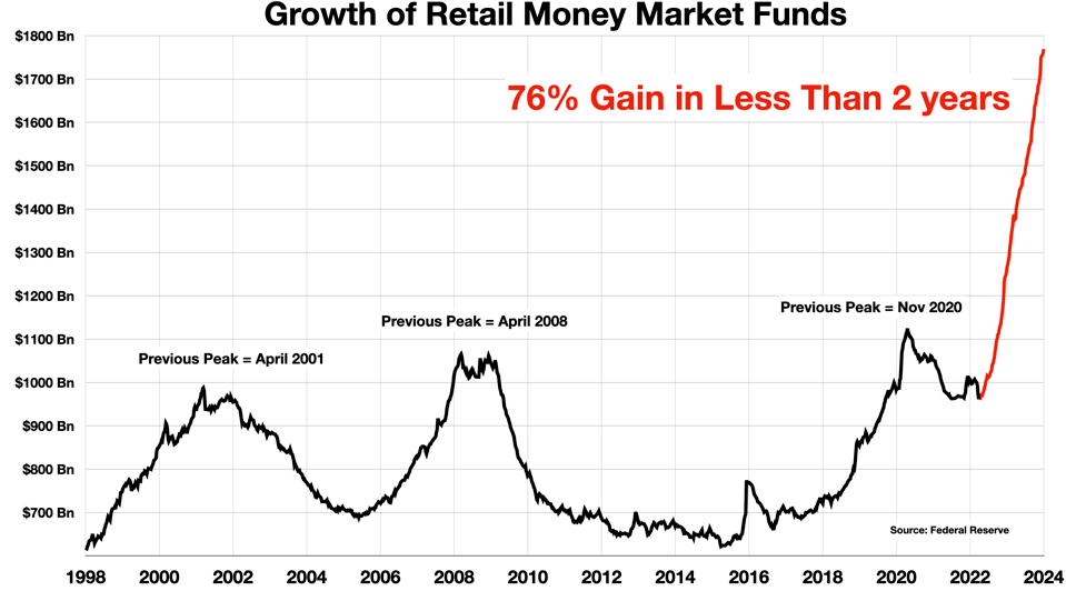
Is this all to the good? Are consumers simply exercising thrift and prudence? Perhaps. But what is the impact on the banking system? What are the implications for equities? Or for other parts of the financial system (e.g., Treasury bonds)?
The surge in money market market funds is a rising tide of uncommitted liquidity, essentially equivalent to cash, parked in a holding tank, movable at a moment’s notice. We have seen in recent crises (most recently the Silicon Valley Bank crack-up) that modern financial technology now enables cash to move much more quickly than ever before.
Three broad questions arise in the connection with this multi-trillion dollar cash build-up:
- What triggered this sudden surge?
- Where did all this cash come from? If one pocket is full to overflowing, some other pocket must be emptying out.
- What will happen when these funds do flow back out of the money market accounts? Where will they go, who will benefit, and who might be harmed?
1. The Trigger
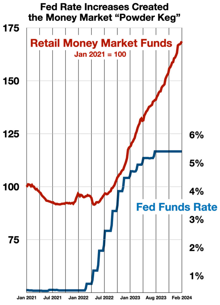
The answer to the first question is simple, clear, and certain. The inflows into retail money market funds began in mid-2022 after the Federal Reserve began raising interest rates. Money market fund levels, lagged by about 6 months, correlate 99% with the Fed Funds Rate. This is the first and most important link in the chain of causality.
2. Where Did All That Cash Come From?
The trillions of dollars that have ended up in these money market accounts took a multistage journey to get there. Much of the cash originally came from from the stimulus programs enacted during and following the Covid-19 pandemic. But it did not immediately go into money market funds. Between Jan 2019 and April 2022, money market accounts increased only about $150 Bn. Most of the stimulus money was first parked in consumers’ personal savings accounts, as deposits in the commercial banking system. Banks added $5 trillion in deposits, more or less equal to the $5 trillion distributed in the post-pandemic stimulus programs.
But that changed when the Fed began hiking up interest rates. Commercial deposits peaked and began to decline at almost the exact moment that the Fed started its interest rate blitzkrieg.
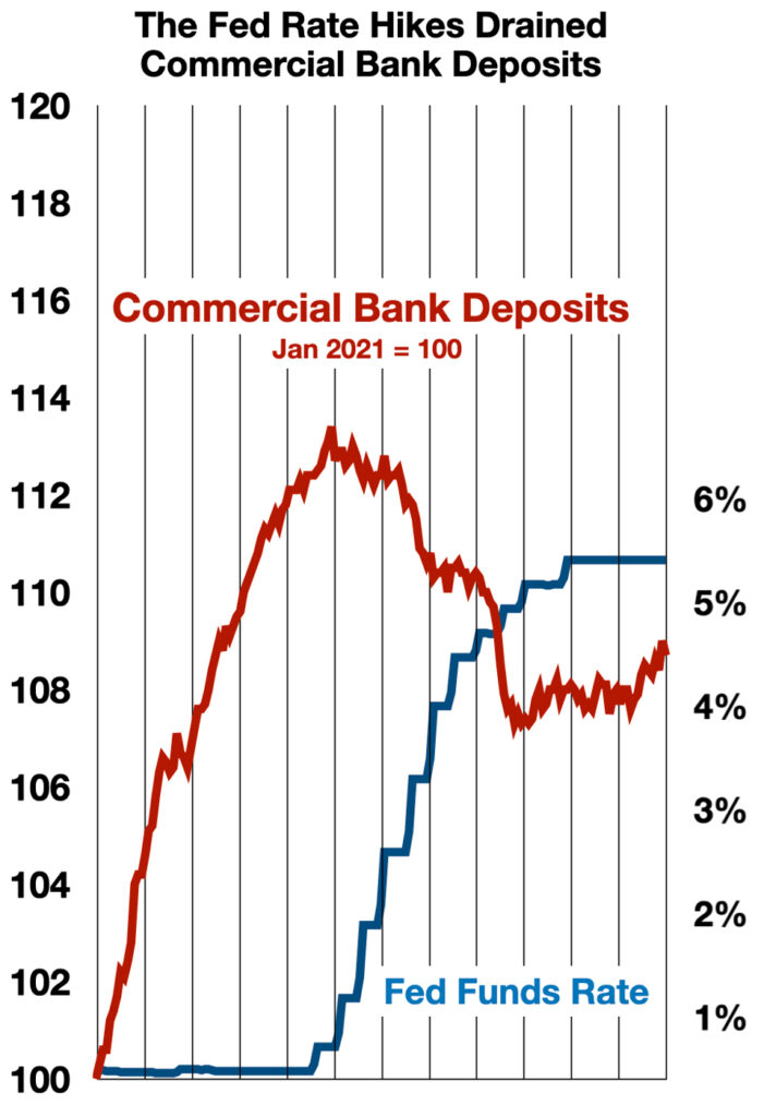
From April 2022 to February 2024, banks saw an outflow of $767 Billion dollars from their deposits, while money market funds took $769 Billion. Another link in the causal chain that looks pretty solid.
These outflows were not without consequence. Depositor withdrawals played a key part in undermining many smaller banks, and in the demise of several (e.g., Silicon Valley Bank). That will be the subject of a future installment in this series.
3. Where Will It Go Next?
What makes a highly liquid position valuable – the ability to redeploy it quickly (indeed, these days almost instantaneously) – is also what makes it dangerous.
When trillions of dollars can move from one corner of the financial system to another almost overnight, it becomes a source of uncertainty and systemic risk. Researchers at the Federal Reserve have been clear about this: “MMFs are vulnerable to disruptive waves of redemptions and runs” (from the 2022 study cited above).
Today’s bloated money market funds have become just such a risk factor. The scale and speed of the build-up are extraordinary. The unwinding of this enormous position could happen just as fast.
The retail segment, while smaller, is the main source of concern. Retail investors are seen as more volatile, readier to chase a rising market, or flee a falling one. As the reservoir of cash parked in retail money market funds has grown, it has begun to worry many observers. On a per capita basis over the past two years, retail money market funds have grown twice as fast as the GDP and seven times as fast as Disposable Income.
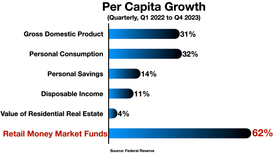
Many observers see this as so much “dry powder” ready to fuel the next leg of a bull market.
- “There is record-high liquidity to push stock prices higher and credit spreads tighter. In particular, once the Fed starts lowering interest rates, some of the $6 trillion in money market funds is likely to find its way into stocks and credit.” – Torsten Sløk, Chief Economist at Apollo Global Management
But is there a downside? A risk for markets already at a record high? Is this too much powder – a “powder keg” – ready to blow the markets sky-high, into binge-and-bubble territory? And if investors exit the money market funds to invest in equities, what do those funds have to sell in order to honor the redemptions?
A Little History
Relative to the value of the stock market as a whole, the current levels do still seem quite moderate. In 2001 and 2008, proportionally larger amounts of buying power pulled to the sidelines, temporarily out of the game. Today’s surge is nowhere near those levels, percentage-wise.
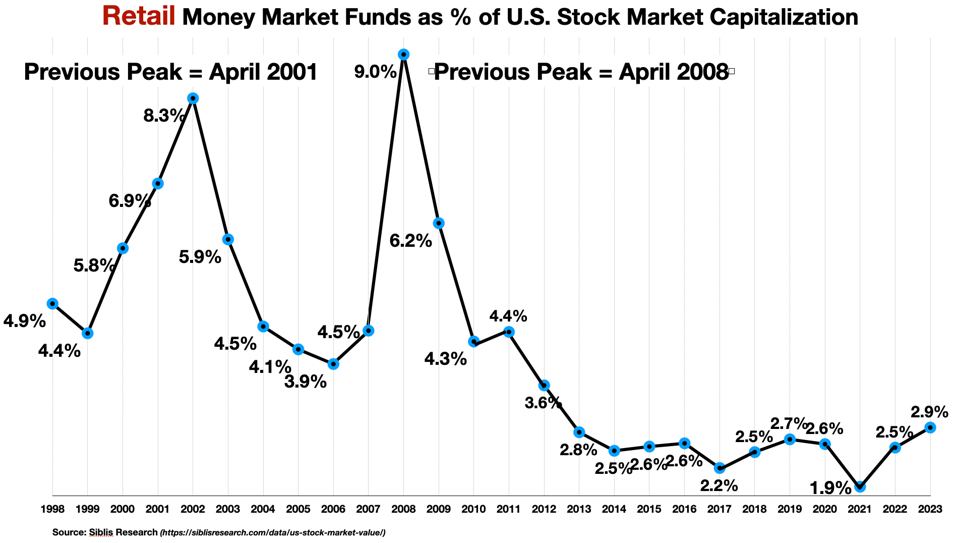
Still, the absolute amount of the sidelined cash is higher today than it has ever been. In this era of Reddit and Robinhood and Meme stocks and the “Magnificent Seven,” a cash pile rapidly approaching $2 Trillion in the “paper hands” (Reddit slang) of itchy retail investors must cast a shadow over any market forecast. If the current level of money market accumulation does not yet ring alarm bells, the speed of the build-up may.
Moreover, combined with the institutional money market cash, the overall levels are much higher as a percentage of the total stock market capitalization. Previous peaks reached 20-30% of the value of the stock market.
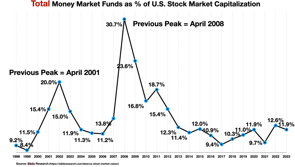
Institutional investors have a different psychological profile, and the flow of funds into the market will probably follow a different pattern, probably less jumpy. But – cash is cash. The “overhang” of potential demand is there, and it seems to be increasing.
From the perspective of the stock market, what does this unusual accumulation of uncommitted liquidity mean? How should it be interpreted? Does the pattern have any predictive value?
Interpretations
Based on (i) previous experience in 2001 and 2008, (ii) a simple model of supply and demand mechanics, and/or (iii) an understanding of retail sentiment as a market indicator, there are several somewhat overlapping interpretations on offer.
- The cash build-up may be warning of an oncoming recession – along with a forecastable turning point to indicate the beginning of the recovery – in short, it may be pointing investors to a Sell signal (now) and a Buy signal (later).
- Or – it may simply represent pent-up demand (“dry powder”), a broadly positive indication for equities, a sign of consumer and investor resilience, which could help the economy avoid a recession and spur the next leg of the bull market.
- Or – like many other indicators of retail sentiment, it may constitute a contrarian signal, a sign of retail hesitancy and conservatism – which could also support a bullish view.
- Or — it may not mean anything at all…
A Recession Signal?
Consumers become conservative in response to economic downturns, and tend to accumulate cash – i.e., to save. This is reflected in both personal savings rates and in the levels of retail money market investments. But the patterns for these two indicators differ in an interesting way.
Personal Savings Rates
The personal saving rate has risen significantly during every recession over the last 50 years and has remained elevated after the recessions ended – but it did not rise ahead of the downturns. It is not a leading indicator.
The 2008 recession is typical of this pattern.
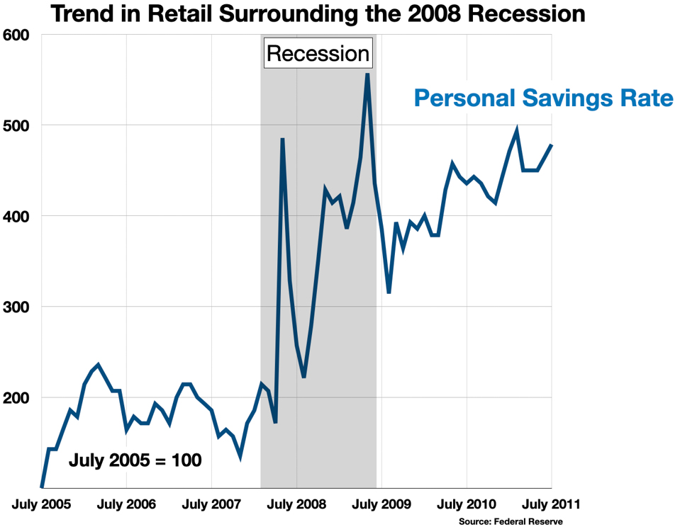
In other words, savings behavior is reactive, not predictive. Savers don’t see the recession coming, and they don’t respond promptly to the recovery afterwards.
In fact, the personal savings behavior is systematically “irrational.” Overall, since 1994, savings rates are 44% negatively correlated with the Fed Funds Rate. That is, people tend to save more when interest rates fall, and save less when interest rates rise – the opposite of what homo economicus should do.
Money Market Fund Levels
Money market funds show a very different pattern. First of all, fund levels rise dramatically prior to (in anticipation of?) a recession, stop rising when the recession hits, and fall steeply as the recovery develops.
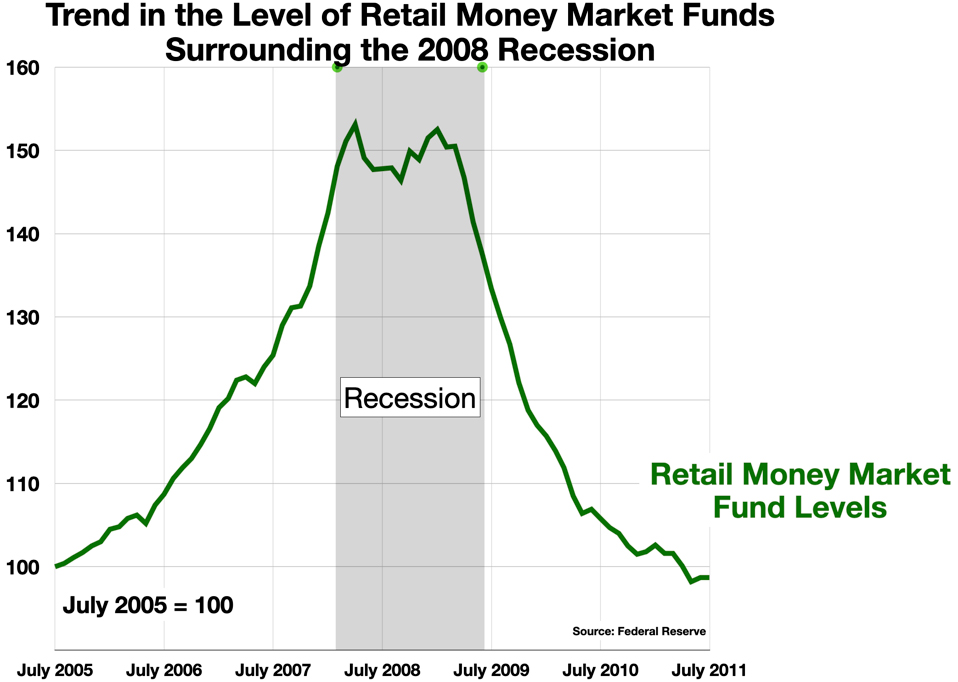
Moreover, the changes in the level of investment in money market funds by retail investors is strongly positively correlated with changes in the Fed Funds rate. It appears “rational.” The pattern is clear even to the naked eye.
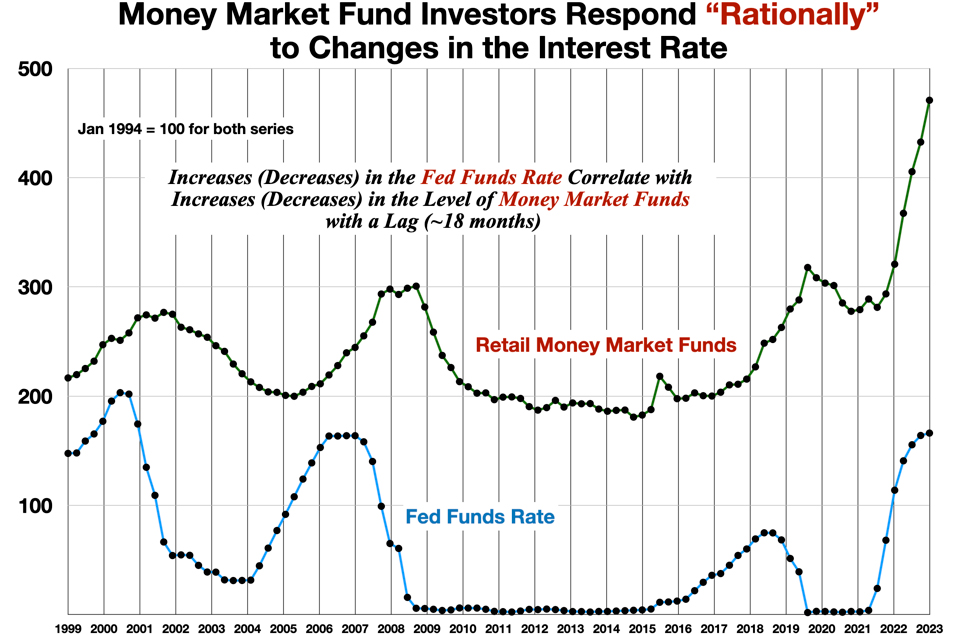
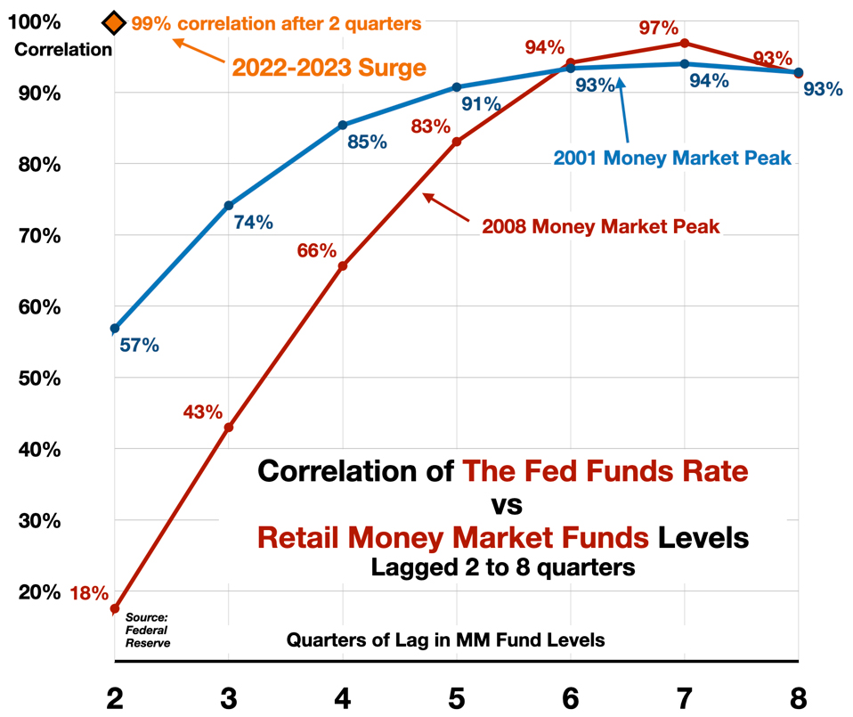
The correlation develops after 12-18 months, and is nearly perfect.
In both 2001 and 2008, money market funds seemed to predict the recession, and even to signal the timing of the onset. Fund levels rose ahead of the downturn, and stopped rising once the recession began.
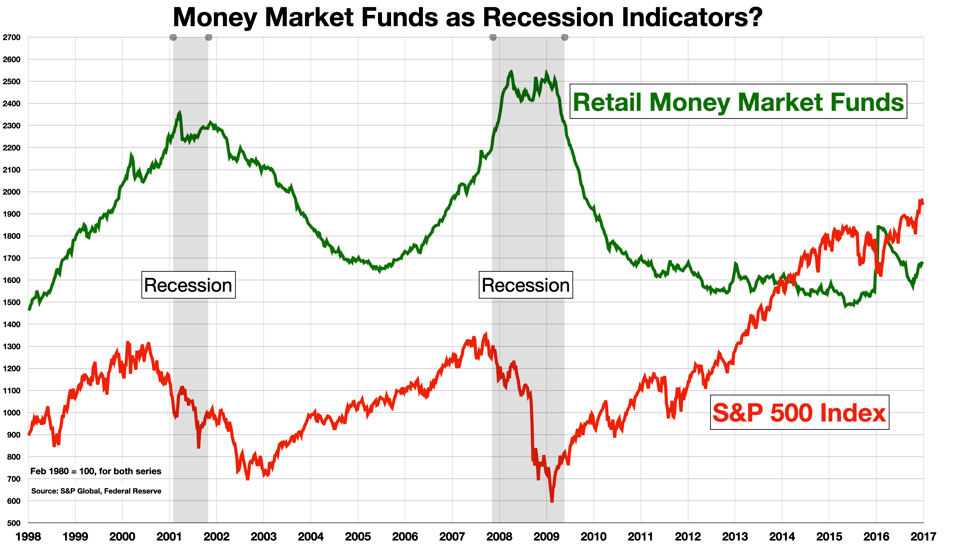
It may be that the current money market surge is also signaling a coming economic downturn. If so, it would align with another classic recession indicator: the yield curve, which as of March 20, 2024 set a new record for the longest period of inversion in recorded history (623 days, and counting).
But most economists and market analysts now believe that a recession is not imminent. The recession-less yield curve inversion and the freakish surge in money market funds may both be anomalous consequences of the Fed’s aggressive rate hike policy. Both the yield curve inversion and the money market fund surge began shortly after the Fed began raising rates.
Dry Powder for a Fresh Rally?
If a recession is not in the offing, the other prominent interpretation is that the build-up is a strong positive signal for stocks. It is seen as delayed or unexercised demand, or buying potential. Retail investors often tend to return into the market later in the cycle, amplifying an already well-developed bullish trend. If so, once the liquidity begins to exit the money market funds it could signal with the start of a renewed market rally.
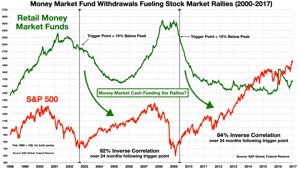
In both 2001 and 2008, a decline of 10% from the peak money market levels accurately pinpointed the beginning of the market’s recovery.
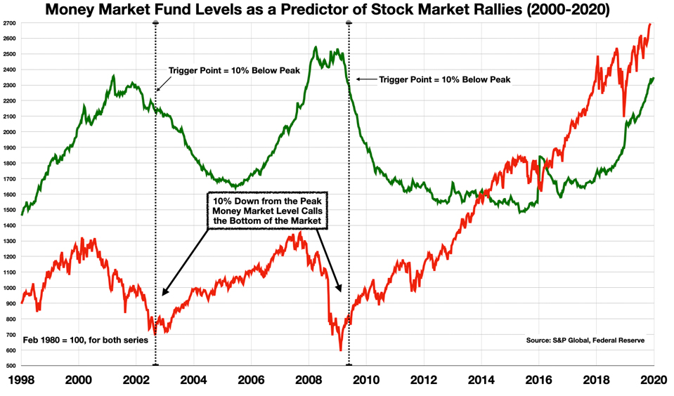
The case for causality looks strong for both of these episodes. In the 24 months following the trigger point, there is a nearly perfect inverse relationship between money markets and the equities market. Stocks went up as money market fund levels came down.
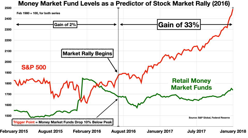
Interestingly, there was a smaller and shorter surge in money market funds in 2015. It was not associated with a recession, but it did coincide with a period of stagnation in the stock market. And once money market levels declined to the 10%-down-from-the-peak trigger point, the stock market almost immediately took off.
A Contrarian Sentiment Indicator?
Sentiment indicators attempt to measure investor psychology – what people think is going to happen in the markets, or the economy in general. There are hundreds of measures of sentiment which many investors explore to predict market trends.
One important trait that most sentiment measures share is that they point backwards. That is, a sentiment metric that would seem to reflect a positive view of the market – an expression of optimism, bullishness – is often seen as a warning of a looming downturn. Retail sentiment metrics, which collate the views of “ordinary investors,” are felt by many to be especially prone to contrarian interpretations. The herd is often wrong. When retail investors are optimistic, it is often taken as a sell signal. When they are fearful and distraught, it is time to buy.
In this context, when retail investors prefer to hold cash (i.e., in money market funds), it is interpreted as a sign of hesitancy, worry, or pessimism about the stock market – in any case, risk-aversion – and as such, it is taken in a contrarian vein as a positive signal that the market is likely to rally.
So, What Will Happen to Equities?
For the previous surges in levels of money market funds in 2001 and 2008, the likely causal sequence on those occasions was as follows:
- Increases (decreases) in the Fed Funds Rate drove increases (decreases) in the level of Retail Money Market Funds, with a lag of 4+ quarters, show correlations up to 97%
- Decreases in the Money Market Funds Level drove increases in the S&P 500 over the 24 months following the first 10% decline, with correlations of 84-92%

This Time It’s Different (?)
The current surge looks different. It is not apparently associated with a recession. The pandemic shock, followed by the fiscal shock of two massive stimulus bills which put enormous amounts of cash in consumers’ hands, probably created a new set of causal relationships.
Federal Reserve policy is still the main driver, however, and the response of money market investors to rising rates has been very fast, reaching correlations of nearly 100% within just months (instead of the 1-2 year lag in previous episodes).
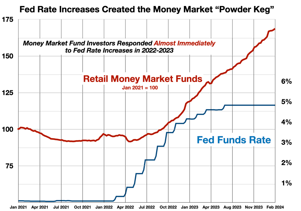
This acceleration of the timeline is another side effect of the Fed’s over-aggressive rate increase policies. It suggests that when the Fed does begin to reduce rates, money market “dry powder” may fire things up quickly and in a big way.
This may not be all good news. Of particular concern are the differences in the composition of the money market funds’ holdings today, compared to past episodes of accumulation and distribution. In 2011, the Office of Financial Research began collecting detailed information on the types of investment vehicles held by money market funds. Two important trends stand out, which have greatly altered the nature of the money market funds’ portfolios since 2011.
- The tripling of the weight of investments in government money market instruments from about 27% of the total to about 77% of the total – and a 6X growth in absolute levels of this category
- The growing levels of repo agreements involved in this eco-system, in particular for Treasury repos (up ~10X since 2011)
This could suggest that if/when the dam breaks and this money market cash begins to flow into the equity markets, it may come out of the Treasury Bond market.
(These bond market implications will be the subject of a subsequent column.)
Money market funds are similar to savings accounts at banks, except that they are uninsured. As huge amounts of cash move into and (soon) out of these vehicles, and perhaps very quickly, the potential for “disruptive waves of redemptions and runs” (as the Fed itself describes the risk) is likely increasing. Pulling trillions of dollars out of banks and Treasurys, and pumping it into the stock market may please equity investors in the short run, but may not be healthy for the financial system as a whole.
Follow me on Twitter or LinkedIn.
About the Author:
Dr. George Calhoun, a graduate of the University of Pennsylvania, received his Doctorate Degree from the Wharton School of Business. He has served in multiple capacities in the Financial Sector and in the Wireless Communication Industry. He has authored multiple articles on subjects of interest to him and several books. His most recent book “Price & Value: A Guide to Equity Market Valuation Metrics” is available through the Publisher Springer/Aspress. Dr. Calhoun currently serves as the Executive Director of the Hanlon Financial Systems Research Center at the Stevens Institute of Technology and is an Advisory Board Member of Vestbridge Advisors, Inc.
Vestbridge Advisors, Inc. (“VB”) Is registered with the US Securities and Exchange Commission as a registered investment advisor with principal offices at 3393 Bargaintown Road, Egg Harbor Township, NJ. The information contained in this publication is meant for informational purposes only and does not constitute a direct offer to any individual or entity for the sale of securities or advisory services. Advisory advice is provided to individuals and entities in those states in which VB is authorized to do business. For more detailed information on VB, please visit our website at www.Vestbridge.com and view our Privacy Policy and our ADV2 Disclosure Document that contains relevant information about VB. Although VB is a fairly new organization, any references herein to the experience of the firm and its staff relates to prior experience with affiliated and nonaffiliated entities in similar investment related activities. All statistical information contained herein was believed to be the most current available at the time of the publishing of this publication.
