
The Flawed CPI The Fallacy Of Year-Over-Year Inflation Reporting
September 18, 2023
By Dr. George Calhoun
Vestbridge Advisors, Inc. Advisory Board Member
Executive Director of the Hanlon Financial Systems Center
Following the release of the August Consumer Price Index (CPI) the headlines were full of muscular scare-words.
- “Resurgent US consumer prices…more angst… fresh signs of stubbornly high inflation” – The Financial Times
- “Inflation accelerated in August…a surge in consumer prices” – The Wall Street Journal
- “Price pressures remain stubborn…marking another month of accelerating inflation” – The New York Times
- “Hot inflation data… inflation hasn’t gone away…the fight isn’t over….inflation is a more persistent threat than it has been in decades.” – Barron’s (various)
- “Inflation is still troublingly high.” – CBS
- “The inflation battle might not be over…inflation is not expected to reach the central banks’ 2% targets until 2025, meaning further pain for households and risks to the outlook.” – CNBC
- “The Fed’s Inflation Battle Is Getting Tougher.” – Barrons again
- “Inflation: Nouriel Roubini Calls Return to 2% ‘Mission Impossible’” – Youtube
Alas, all this excited messaging is just plain wrong.
The fact is that the post-pandemic episode of “inflation” in the U.S. is now essentially over. The Fed’s 2% target has nearly been achieved. The evidence is right there in the “official” figures.
Why doesn’t the media see this?
The disconnect arises from a misunderstanding of how the index is distorted by the way it is massaged to try to control the volatility in the underlying data.
The Volatility Problem
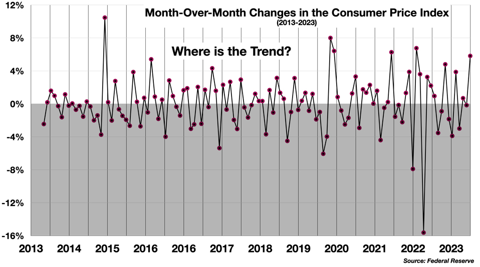
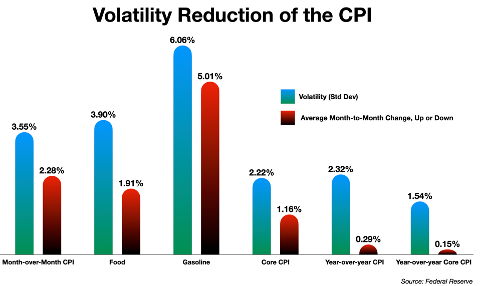
Ideally, monetary policy would be tuned and adjusted quickly based on more or less realtime information about price trends in the economy. For a number of reasons, however, realtime inflation data is quite volatile, which makes it hard to interpret, hard to see the trend. The headline CPI itself bounces around a great deal. The average month-over-month change in the CPI is 2.3%. Exactly 50% of the monthly reports from 2013 to 2023 saw increases over the previous month and 50% showed decreases. The annualized monthly readings over the last 10 years have a relatively large standard deviation of ±3.55%. About 2/3rds of the monthly CPI releases will fall between –0.73% and 6.36%. This means that 1/3rd of the data points will lie outside the relatively broad range. It’s a lot of volatility.
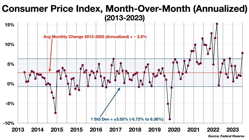
Trends are short and reverse quickly. In 10 years, the direction of the change (increasing or decreasing) has been maintained only once for as long as 4 months (June-Sept 2015). In 66 of the 120 months in the series, the direction of the trend reversed from positive (increasing inflation) to negative (decreasing inflation) in the very next month. The chart appears chaotic. There is, in short, no discernible trend in the month-to-month figures.
This high volatility makes it almost impossible to calibrate monetary policy on the basis of monthly readings. To reduce the volatility, the Bureau of Labor Statistics, the Federal Reserve, and many economists have adopted two strategies: trimming and averaging.
Trimming refers to any technique that removes some of the more volatile components from the index. The Fed has a number of such modified versions of the index, the most prominent of which is the so called Core CPI, which eliminates Food and Energy prices from the calculation.
Averaging has traditionally taken the form of a year-over-year comparison, rather than month-over-month. The latest headline CPI figure is a comparison of the price level for August 2023 with the price level for August 2022.
Taken together, these measures appear to solve the problem, lowering the standard deviation by more than half, and reducing the monthly variation in the CPI by almost 95%.
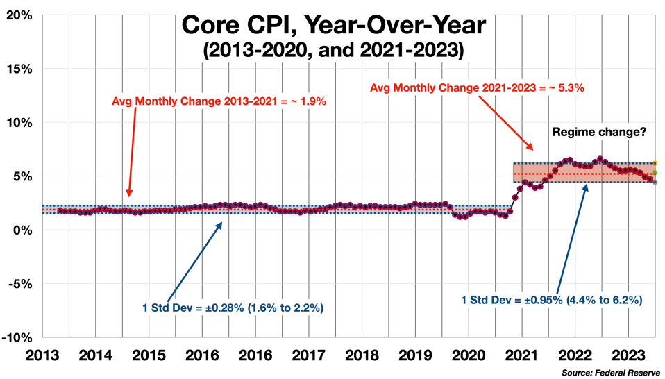
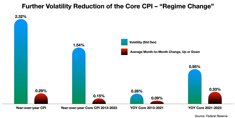
Volatility can be reduced even further with another statistical trick. The trend line suggests that the 10-year Core CPI trend actually combines two different “regimes.” From 2013 to 2020, inflation was very stable and the use of trimming plus averaging eliminated almost all of the volatility. From 2021 to 2023, as inflation “surged” following the supply-chain disruptions caused by the pandemic and Ukraine War shocks, the volatility increased somewhat but was still much lower than the raw monthly numbers, and below the overall Core CPI for the decade.
Policy-makers have taken comfort from the apparent stability of these trend lines. The Fed and much of the public have come to believe that the CPI and the Core CPI provide a true picture of inflation.
They do not. Both trimming and averaging introduce problems for interpreting the true underlying signal.
Trimming is problematic because it is not clear how or what to eliminate from the index. It opens the door to manipulation: “If you torture the data long enough if will confess to anything.”
But averaging is far worse. The form in which averaging is applied – year-over-year comparisons – introduces systematic distortion that is highly misleading, not widely recognized, and has caused (and is still causing) major monetary policy errors.
The Problems with Trimming
Fed economists manifest considerable uncertainty about just how to trim the CPI (or the Personal Consumption Expenditures index – the PCE – that the Fed has long preferred to the CPI). There are various trimming techniques in play, including:
- Core CPI (or Core PCE) – eliminating Food and Energy
- The 16% Trimmed Mean (pushed by the Cleveland Fed) – eliminating each month the top 8% and the bottom 8% of index components ranked by their price change
- The Trimmed Mean (from the Dallas Fed) – uses a more nuanced trimming algorithm to remove the components each month that show big increases or large decreases
- The Sticky CPI (from the Atlanta Fed) – focuses on the components which tend to change the least
Recently, the Federal Reserve has taken up trimming with gusto, promoting measures like Core Goods and Core Services, and now Supercore Inflation, which focuses on services only, but excluding Energy and Housing. There is also the Multivariate Core Trend (MCT) Model proposed by the New York Fed, as well as the Underlying Inflation Gauge (UIG), also from the New York Fed. It’s becoming complicated (and I admit I have not yet caught up with all these options). The pros and cons attached to all these trimmed metrics would be a fine topic for someone’s PhD dissertation, perhaps.
The emerging problem here is that with so many measures modified in different ways the selection of a particular measure can start to seem like a cherry-picking exercise based on the policy premise that is being advocated. The popularity of Supercore in particular has grown as the other measures, especially the “Goods Inflation” component, moderated dramatically last year. It is cited apparently as the basis for continuing on the current policy track. Did the Fed need this new trimming technique to justify its hawkish stance and keep raising rates?
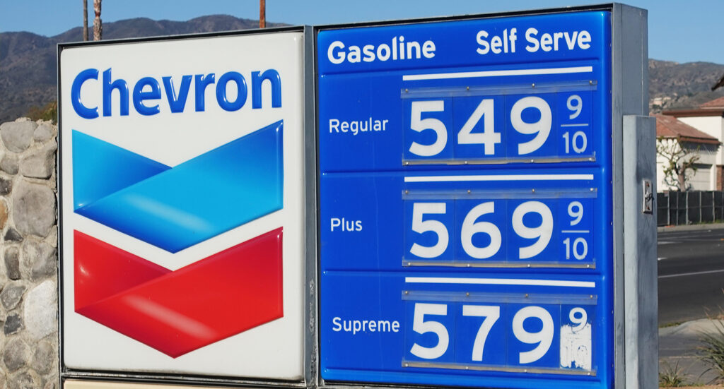
Still, trimming is useful and probably necessary in some cases, to counter the extreme volatility of certain components. Gasoline is a best case for trimming. It is a regular consumer purchase (unlike other components that have sometimes boosted the index, like used cars or airfares), so consumers are actually exposed to its “high frequency” fluctuations (it is one of the few metrics that is reported on a weekly basis by the BLS) – and it is extraordinarily volatile.
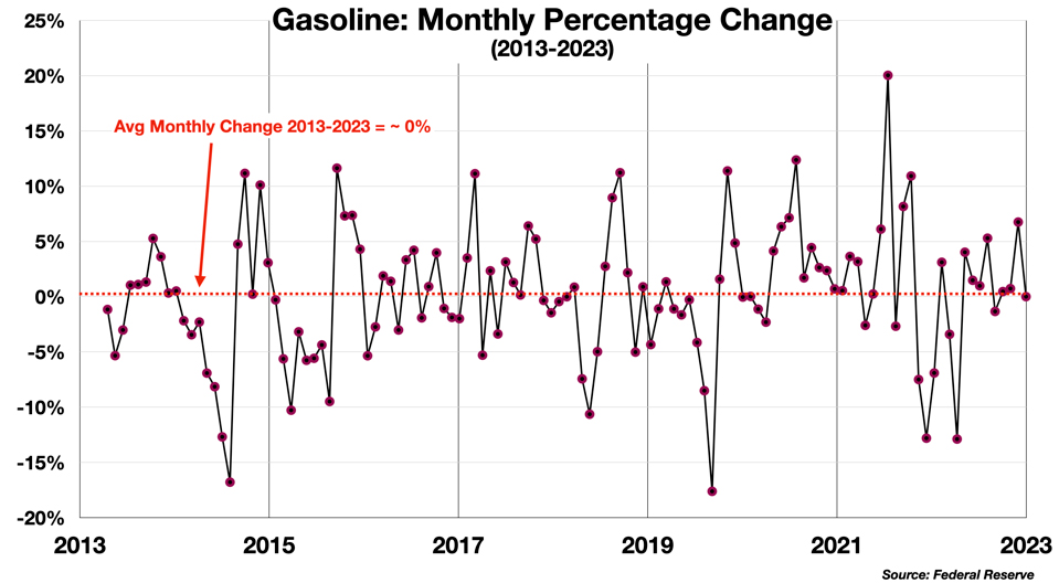
Gasoline is the outlier that distorts CPI for August. The Wall Street Journal calculates that half of the August increase in the CPI was due to gas price increases. Gas was up 10.6% last month, which sounds…“bad.” But really, how bad? It works out to about $2.50/week for the typical driver of a car with typical fuel efficiency. (At some point in the analysis, it is a good idea to set the percentages aside and bring it back to the actual pocketbook impact.)
Should monetary policy be driven by a $2 or $3 weekly bump that is likely to be temporary? The price of gasoline has actually declined over the longer term. Gas is 15 cents/gallon cheaper than it was a year ago, and more than a dollar-per-gallon cheaper than the peak in June 2022.
Volatility is thus a real problem here. The price of gas dropped by $1.40 a gallon from June 2022 to July 2023, and then rose by 28 cents in August 2023. It is still down about 25% from its peak last year. Is there really a crisis here? A surge? How should it be assessed? So, yes, trimming energy out of the picture probably makes sense most of the time.
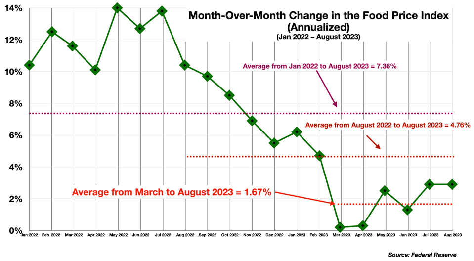
Food prices, on the other hand, are a lesser concern right now. Food inflation is running at a 2.3% rate over 3 months and a 1.6% rate over 6 months, compared to 4.8% for the last 12 months, and 7.4% for the last 18 months.
These figures, however, raise a more important problem: Should we pay attention to the 3-month run rate, the 6-month run rate, or the Fed’s year-over-year 12 month average? Which is more meaningful? It brings us to the problem of averaging.
The Problems With Averaging
Averages should always come with a warning label. There is the old story of the man who drowned in a river that was an average of 6 inches deep. The reader may take in this aphorism with an understanding chuckle, recognizing that of course both ends of this paradox can be true: a broad shallow river may conceal a narrow deep channel in the middle. But the sharper point is that relying on an average measure carries a significant, and a hidden risk.
The problem is that averaging destroys information. That is in fact what averaging is designed to do. Averages throw away the “outliers.” They smooth out the dips and bumps. They dampen the volatility in the signal, as shown above.
But – and this is critical here – averaging also obscures any change in the trend, if there is one. In so doing, it delays the recognition of that change by the length of the averaging interval. In the case of the standard inflation statistics like the headline CPI, that interval is 12 months. The year-over-year comparison blends the current state of affairs, the realtime direction and momentum of the price level, with old data going back to last year. The Federal Reserve has been widely criticized for being late to recognize the onset of inflation in 2021 and 2022 – but what should we expect given that all of the metrics they follow are locked into a 12-month averaging delay?
Is this always a problem? It depends. If we can assume (and show) that the variations that are erased are evenly (randomly) distributed on both the upside and the downside of the average, then the average will help discern the actual trend. The price of gasoline over a long period would seem to show —roughly — a symmetrical distribution of jumps and dips, and so the average may make sense as a way of taming the signal and avoiding whiplash policy responses. Over the last decade, the burden of gas prices on the consumer has basically evened out, with significant dips offsetting the periods of increasing prices.
However, when there is a strong and important change in the directional pattern underlying the data, averaging is not harmless. When there is a big dip in the middle of the river, or, in economic terms, when there is a shock (like the pandemic), or a shift in the overall economic regime – like the petering out of transitory inflation – averaging the data will hide this fact until it is too late to respond effectively.
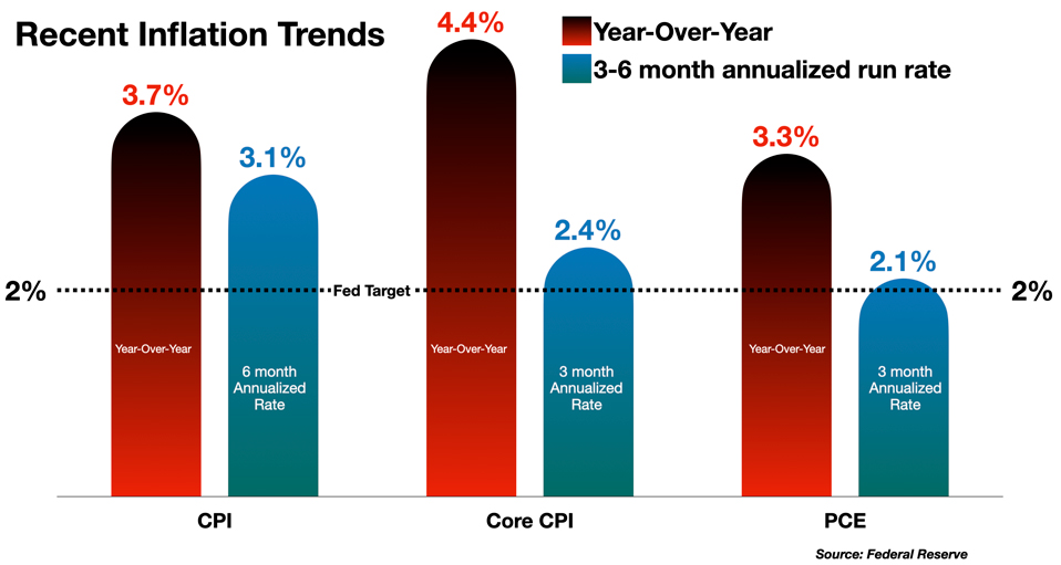
There is a risk that this is happening again. The official year-over-year Core CPI from August was 4.4%. But over the last 3 months the Core CPI is running at a 2.4% rate (annualized). The Fed’s preferred PCE is running at 2.1%. In other words, the Fed has essentially achieved its inflation target. But some Fed officials are still convinced – along with the mass media outlets – that inflation is still raging. They are misled because they are looking backwards instead of forwards.
The danger is that this will drive policy errors. When decisions are based on data that is running behind events, rather than aligning with the current realities, the risk of making a mistake is amplified.
There are indications that some at the Central Bank are confused by this. For example, Cleveland Fed President Loretta Mester recently declared that “we’ve been underestimating inflation.”
(No. Sorry, Loretta. You’ve been overestimating it, for at least a year, because of the flawed instrument used to measure it.)
She advocates for continuing policies based on an erroneous interpretation of the data.
- “Mester also said she expects ‘meaningful’ improvement in inflation soon, with price growth moving down to about 3.75% this year and reaching the central bank’s 2% goal in 2025.”
Reaching the goal in 2025? Two more years of this monetary malpractice? As the first chart above shows, the unmodified CPI is already below 3.75%.
Moving Forward (Rather Than Looking Backward)
Imagine if the speedometer in your car was designed to show you how fast you were driving compared to yesterday at the same time, rather than how fast you are going right now. Or take a more pertinent analogy: interest rates. No one wants to hear about the average interest rate over the last 12 months, or the year-over-year comparison. Everyone is focused on what the rate is right now, and where it is going next. It is easy to grasp the importance of getting close to real-time information about interest rates. Why then can we not see the same importance of getting a sense of real-time inflation rates?
The volatility in the monthly numbers has many sources, and there are many countermeasures. Averaging can help, if it is used judiciously. But one must ask that this point how long the averaging interval needs to be to bring the volatility down within acceptable limits and establish the underlying trend. It does seem that 3-6 months of averaging is sufficient, and more accurate and timely than the obsolete year-over-year comparison.
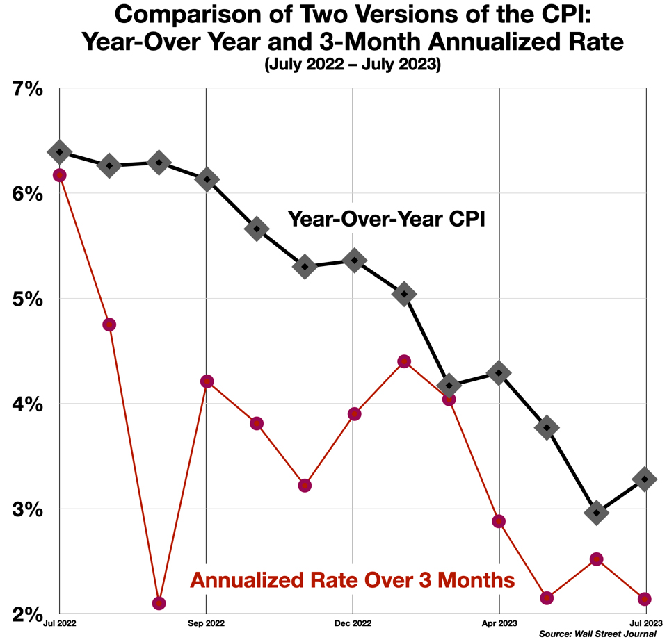
A few in the press are finally beginning to see the problem with lengthy backwards-looking comparisons. The Wall Street Journal described an “important shift” in thinking at the Fed about rate increases, and portrayed (for the first time I have seen it in the mainstream media) a chart comparing 3-month, 6-month, and year-over-year inflation figures.
Even Paul Krugman, writing in the New York Times, has come out for the shorter averaging interval.
- “News reports often lead with inflation over the past year. There are reasons to focus on one-year rates of change: They help smooth out noisy monthly data, and you don’t have to worry about seasonal effects. And in the past the one-year inflation rate was probably, as my father used to say, good enough for government work. At this point, however, I’m pretty sure that most working economists consider a year to be too long a lag. The inflation situation is changing rapidly, probably because we are finally working out the supply kinks caused by the pandemic. If we look at core inflation, which excludes volatile food and energy prices, the one-year inflation rate is still unacceptably high, but over the past three months inflation has run at only 2.4 percent, and even this number partly reflects delayed effects of a shelter-price surge that ended many months ago.” – Krugman
Lael Brainard, former vice-chair of the Fed, gave a speech in January that was richly laced with references to short-term averages, and clearly implied a preference for the shorter term in interpreting the trends.
- “There are tentative signs that wage growth is moderating. Growth in average hourly earnings has softened recently—stepping down to 4.1 percent annualized growth on a 3-month basis in December from roughly 4.5 percent on a 6-month and 12-month basis. … Inflation in December is likely to have run at around a 2.3 percent annualized pace on a 3- and 6-month basis, as compared with 5.1 percent on a 12-month basis. This deceleration reflects an easing… Energy and core goods each subtracted nearly three-fourths of 1 percentage point from 3-month annualized total PCE inflation….Core PCE inflation is running at a 3.1 percent annualized pace on a 3-month basis—below its 3.8 percent reading on a 6-month basis and 4.5 percent on a 12-month basis. … Housing services inflation remains stubbornly high at 8.8 percent on a 3-month basis—compared with 7.7 percent on a 12-month basis…. nonhousing services are running at about 4.4 percent annualized inflation on a 3-month basis… [etc. etc.]”
Some at the Fed, like Brainard, apparently understand the distortion created by year-over-year averaging – and are perhaps beginning to nudge the organization away from this inevitably lagging measure and towards acceptance of a closer-to-real-time picture of the economy. Let us cheer them on, for without taking this step the central bank will not escape the chronic problem of policy delay that has afflicted monetary policy for quite some time.
Follow me on Twitter or LinkedIn.
About the Author:
Dr. George Calhoun, a graduate of the University of Pennsylvania, received his Doctorate Degree from the Wharton School of Business. He has served in multiple capacities in the Financial Sector and in the Wireless Communication Industry. He has authored multiple articles on subjects of interest to him and several books. His most recent book “Price & Value: A Guide to Equity Market Valuation Metrics” is available through the Publisher Springer/Aspress. Dr. Calhoun currently serves as the Executive Director of the Hanlon Financial Systems Research Center at the Stevens Institute of Technology and is an Advisory Board Member of Vestbridge Advisors, Inc.
Vestbridge Advisors, Inc. (“VB”) Is registered with the US Securities and Exchange Commission as a registered investment advisor with principal offices at 3393 Bargaintown Road, Egg Harbor Township, NJ. The information contained in this publication is meant for informational purposes only and does not constitute a direct offer to any individual or entity for the sale of securities or advisory services. Advisory advice is provided to individuals and entities in those states in which VB is authorized to do business. For more detailed information on VB, please visit our website at www.Vestbridge.com and view our Privacy Policy and our ADV2 Disclosure Document that contains relevant information about VB. Although VB is a fairly new organization, any references herein to the experience of the firm and its staff relates to prior experience with affiliated and nonaffiliated entities in similar investment related activities. All statistical information contained herein was believed to be the most current available at the time of the publishing of this publication.